
This post is also available in different formats so you can read on the go or share it around!
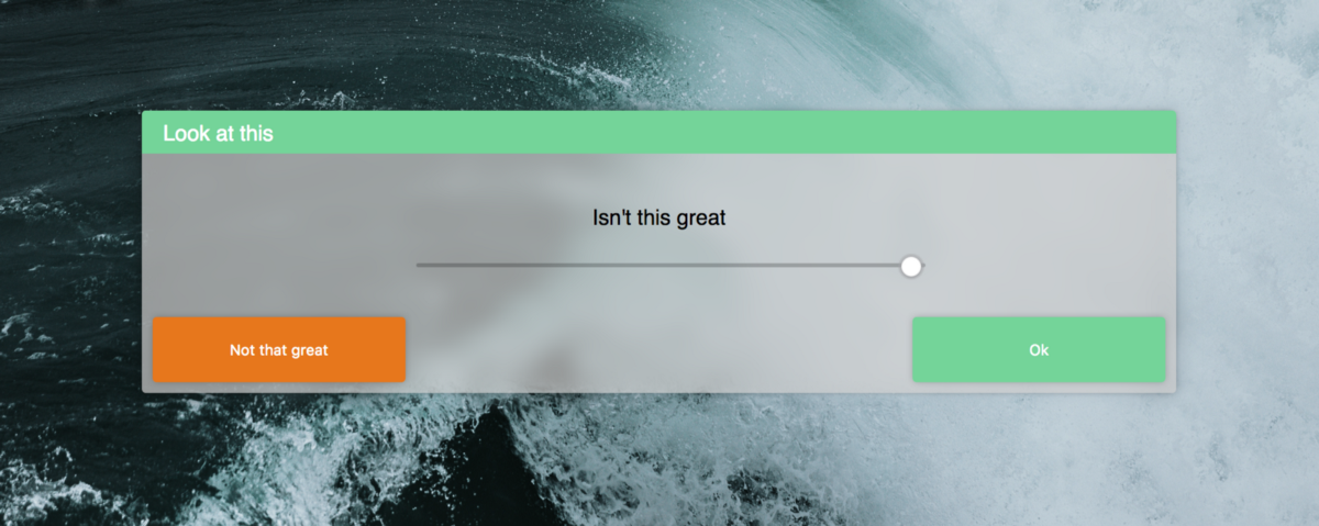
CSS (Cascading Style Sheets) is the technology that makes the web less dull and boring. It breathes life into the web pages we view everyday and sometimes strikes fear into the hearts of developers who aren't accustomed to the intricacies of CSS and the eccentricities of browser's interpretations of the rules. I like CSS, it's an incredibly fun challenge to take a design and try to recreate it in CSS while using as few elements as possible and trying to figure out the combination of rules required to get your UI looking and responding just right. Here are some cool CSS features which aren't fully supported by every browser yet but are still great fun to play around with.
Grid
Grid is the most useful layout features we've seen since flexbox. It allows for layouts to be achieved much quicker than before and without the use of external libraries. When used in combination with the new fraction units, entire layouts can be created in seconds instead of minutes spent meticulously arranging flexboxes or hours spent wrestling floats and the box model.
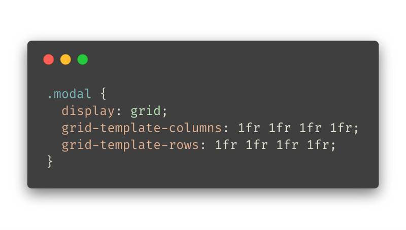
Defining a grid is relatively easy, just set display: grid; and then you can use the handy grid-template-* to define the number of columns and rows and their sizes. In the example above, I have used grid-template-rows: 1fr 1fr 1fr 1fr to specify 4 rows of equal size. The fraction unit is useful because it is easy to add and remove without the calculations of using percentages. This means that columns or rows could be added programmatically with ease and they will resize accordingly.
Tooling
The tools in Firefox and Chrome are great for viewing and manipulating grids.
CSS Grid in the dev tools on Mozilla Firefox
Compatibility
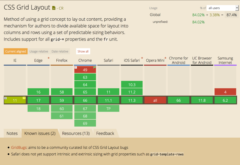
Grid compatibility on major browsers from https://caniuse.com/
Support for grid is getting better all the time and most major browsers support grid in some capacity. Even Internet Explorer 11 is able to use grid with a vendor prefix. Mobile browsers fare okay as well, Opera Mini is the exception. So this feature is pretty safe for general use, as always you will need to test on a variety of browsers and may need to implore some fallback styles just in case.
How to get started with CSS grid?
If you're not familiar with how grid works, I recommend the following site. You can visually adjust your own grid and output the code. This is a great way to get tinkering as quickly as possible. Or there is always the MDN web docs for grid which are a good reference.
Variables
SASS, LESS and other pre-processors have had some very useful features to fill in the gaps where CSS hadn't caught up. One such feature is variables, being able to easily define variables and use them throughout a stylesheet is very useful it could potentially allow for easy theming without any extra work. Although the syntax is a little obtuse, it fulfils its purpose.
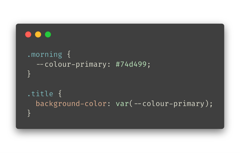
Defining and using CSS variables is easy but I'm not sold on the syntax. The class .morning defines --colour-primary as a variable (use the —-to define a variable) and the title will use that variable if it is a descendant. You can define all your CSS variables in a :root element but for the example, I defined them in a class which could be applied to an element and toggled.
Toggling a class to change the value of a css variable
The above example shows toggling a class which redefines the css variable and affects the decedents colour.
Tooling
Firefox will show when a CSS variable is being used and hovering over it will display the definition. It's not as polished as a normal colour (it doesn't show the colour picker or swatch) but it's workable. Chrome dev tools will display the variable but not it's value.

Compatibility
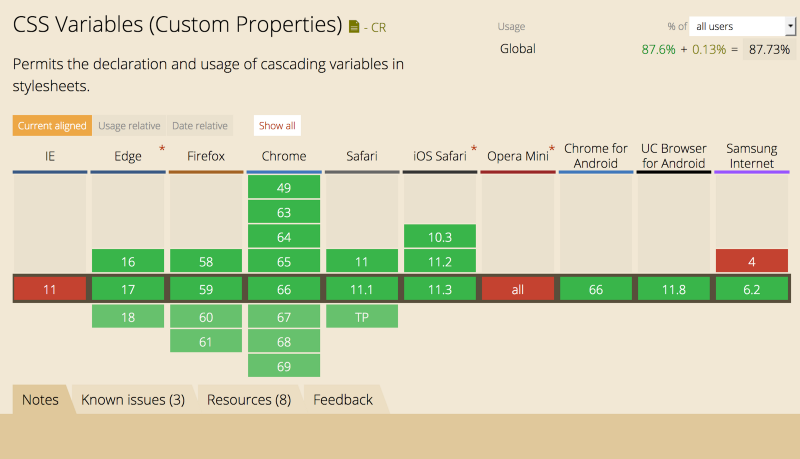
Variable compatibility on major browsers from https://caniuse.com/
Major browser support is pretty good across the board for variables, the exceptions being Internet Explorer 11 and Opera Mini. So, provided you set some fallback styles, it should be okay to use.
How do I get started with variables in CSS?
The syntax is pretty straight forward so the best advice I can give you is to experiment. You can use the following syntax var(--my-orange-theme, orange); when you want to set a default when the variable is not found.
Filters
CSS filters are one of the coolest features that is making its way into modern browsers. The toolkit for web design is growing rapidly and filters offer possibilities which were not easily achievable in the past. Used in conjunction with CSS animations or transitions, filters can now be used in a more manner. Filters can be added like any other rule in CSS and there is a range to choose from.
A faux background blur using CSS
The above example uses the blur filter on an image to give the appearance of a background blur, this uses another div with the same background image within it to achieve the effect. Although this is not ideal, browsers don't yet support the backdrop filters except for Safari.
Tooling
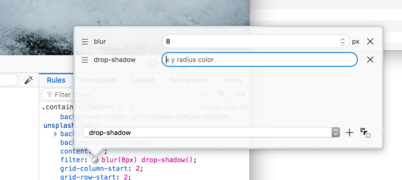
Firefox offers a great experience in the developer tools when editing CSS filters. You can add new filters to the list, change the order of operations and edit them visually.
Compatibility
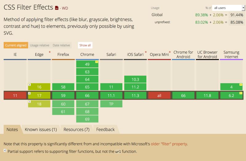
Filter compatibility on major browsers from https://caniuse.com/
Basic filter support works on most major browsers so it is safe to use for visual difference and non critical elements. More advanced support is on the way but the basic set of filters is a good start.
How do I get started with CSS Filters?
The easiest way to get started is by checking out the MDN Web docs. It is a solid cheat sheet with the possible filters you can apply and how they work.
I can't wait for more cool CSS feature support to arrive in modern browsers but until then, you might as well experiment with whats available right now.
Thanks for taking the time to check out some new-ish CSS features and seeing how they can be applied in daily use. Let me know what CSS feature you're holding out for.

A Fullstack Software Engineer working with React and Django. My main focus is JavaScript specialising in frontend UI with React. I like to explore different frameworks and technologies in my spare time. Learning languages (programming and real life) is a blast.