Designing UI for differences based on context
Why Deathloop's console UI is awkward

This post is also available in different formats so you can read on the go or share it around!
Deathloop’s UI makes some odd decisions that pull you away from the experience of the platform it runs on. Deathloop isn’t unique, there are more video games, mobile apps and websites than ever before and with that comes challenges when making experiences for multiple platforms and environments.
Controller navigation
I play video games primarily on PlayStation 5. This is on a sofa with a controller, looking at a large TV. This is the context of how I experience most video games. There’s a lot of context packed into a few short sentences: The choice of console vs. PC, use of controller vs. keyboard and mouse, size of television, and this doesn’t even go into some nuances of my setup. The environment in which a person experiences the game is important to think about when designing the game itself, if I chose to play video games on a PC with a keyboard and mouse, the environment, context and expectations are different and the experience should match.
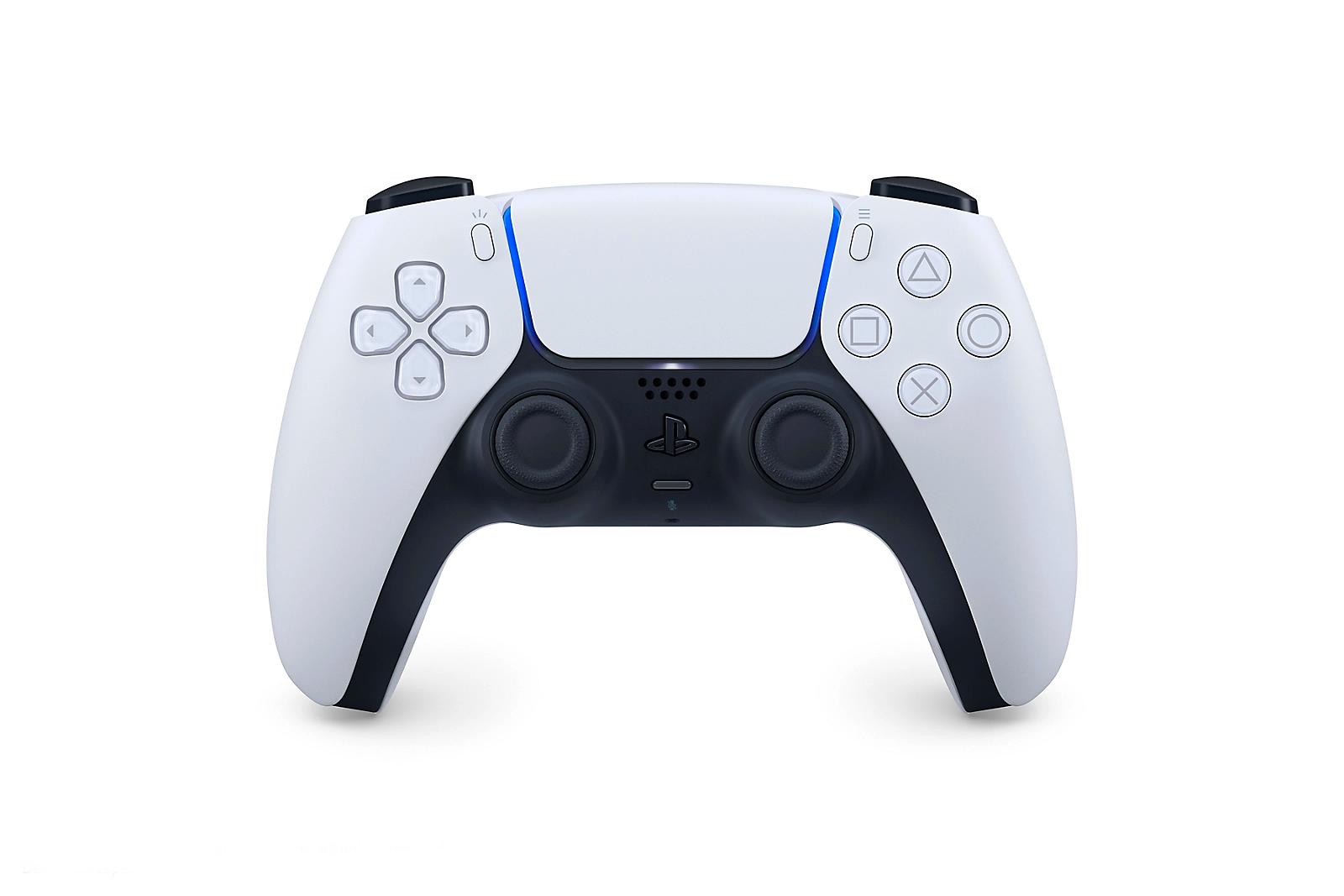
Taken from https://www.playstation.com/en-us/accessories/dualsense-wireless-controller/
The primary input is the DualSense controller. It has a D-Pad, two analogue sticks and a touchpad as the most-often used forms of input for navigating the UI. Most often, the D-Pad and left analogue stick are used throughout the operating system, and so that sets the expectation that you can navigate the user interface of video games in the same way. Compared with a precise precision input device like a mouse, that you directly control movement to specific parts of the UI, interfaces designed for controllers work a bit differently. A press on the left D-Pad button will go to the item on screen that is logically left on the screen, or you may have some more precision in being able to move diagonally with an analogue stick.
Deathloop is an example of UI that breaks conventions, and not for good reason.
What’s the problem with the UI in Deathloop on consoles?
The left button focuses the option on the left, the right button moves focus to the next logical item to the right, and so on. This is how most video game UIs designed for use with controllers work. Not Deathloop, for whatever reason, they decided to use a cursor and viewport. The left analogue stick controls the cursor, the right analogue stick controls the x and y movement of the viewport and finally L2 and R2 triggers are used for zooming out and zooming in. So, how’s the experience? Awkward. This is not unique to Deathloop, but it’s the most recent game I really enjoy that I’ve seen do this.
The issue I have with this UI is that it breaks conventions that have been built up with experience of navigating the operating system and navigation in other video games. I’ve observed this more frequently with ports to consoles by developers that aren’t experienced with how consoles work and those conventions. They designed and built for PC but decided to try to get their game on other platforms without doing the research. This isn’t the case here, Deathloop is made by Arkane Studios, who’ve got lots of experience making games for consoles; Prey is a game from 2017 that doesn’t have this UI paradigm.
This was a conscious decision, it’s not lack of experience, it’s a choice that was made to break away from expectations for some reason. What proves this is within Deathloop itself, there is normal D-Pad/analogue stick navigation in parts of the UI, just not everywhere. If anything, this makes it more confusing. Some of the UI follows convention, some does not. The only reason I can see, is that they wanted to capture a cork-board style series of notes that are arranged outside of a grid — but they’re not. There’s nothing stopping the developers from falling back to traditional navigation if the player presses the D-Pad.
Why is it important to build for the platform?
Different operating systems and devices have a different set of features, expectations, and conventions. They’re used in different environments by all types of people. Designing for these differences results in experiences that feel part of the platform, part of the ecosystem, and part of a cohesive and considered experience. Knowing this allows you to design something that embraces differences rather than trying to conform to them.
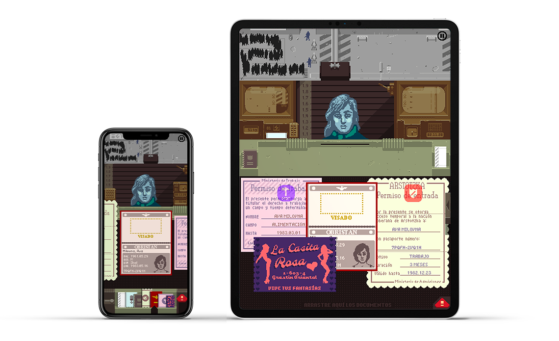
Image taken from https://dukope.com/devlogs/papers-please/mobile/, Copyright © 2022 Lucas Pope
Lucas Pope, the creator of “Papers, Please” wrote a great blog post on how they went about porting their game to mobile and the challenges they faced. It’s a good deep-dive into how a game originally intended for PC, a moderately sized landscape screen, and precision input device can be redesigned to fit a different platform. This meant redesigning for a portrait screen, touch input, and limited screen size. This attention to detail and considering the platform, the expectations and how people would interact different with the game results in something that feels like it’s meant to be. When you don’t design to take advantage of the platform and don’t consider the differences, it’s glaringly obvious. The UI in Deathloop feels more at home with a mouse (still a bit awkward) but, it feels very out of place with a controller.
Multiple platforms without the fuss
I think it’s important to build for the platform you’re targeting, especially if you’re only focusing on one. Really get to know it and learn the patterns and best practices. If you need to target more than one platform at the same time, there are tradeoffs to ignoring this advice. It could be that maintaining a consistent brand is critical or maybe the cost of development when looking at different platforms. So what do you get by ignoring them platform?
Consistency above all else
Frameworks like Flutter are attractive because you can create experiences for iOS and Android that are identical. Both operating systems are already quite similar, follow similar enough conventions that this is the smoothing over of differences for one amorphous experience is an attractive option. It preserves the brand above all else, so if a user switches between the two experiences, they’ll feel at home. A side effect of this approach is that it cuts down development and design costs too.
More bang for your buck
Cost is a big factor in whether an experience gets the attention it deserves. It’s difficult to without spending countless hours getting to know the unique features the platform has to offer, the conventions used, and the broader context of how people interact with the surrounding ecosystem. It’s challenging to build a cohesive experience that spans multiple platforms without making compromises. If you want a single team developing a solution or to cut down on the design overhead, you may decide to reach for something close-enough. For mobile, this could be something like React Native, a framework that gives you the ability to tap into specific platform features if you need to without as much investment.
What about the Web?
So far, I’ve discussed specific operating systems, devices, and ecosystems, but there’s one platform that stands out as the most rebellious for following the rules. As much as I love the web and its ubiquity, if we consider the web as a platform that spans multiple devices and contexts, it goes against the platforms it lives on. The web we know today is as varied as the platforms it appears on, the people who use it, and the problems it solves. This anomaly is simultaneously a marvel in consistency of experience and an inconsistent conglomeration of parts that coexist together.
The benefit of the web is that as developers, we have an enormous amount of control over presentation. It’s possible to craft unique experiences that aren’t constrained by many limitations. There’s nothing stopping you from changing how the cursor looks, animating elements on the screen, designing your own navigation paradigm. The modern web is flexible and powerful enough to create a variety of experiences that break the mould. The benefit (and the downside) is that web browsers run almost everywhere and whatever platform it runs on, it’s likely to look the same. The only differences come down to device-specific features like camera, microphone, notifications, and screen size etc.
The thing that ties everything together on the web is convention by proliferation. Patterns start to emerge though inspiration, copying and best practices. A lot of SaaS products share similarities because they follow the same design principles, they might use similar CSS frameworks or follow the same broad guidance. This produces experiences that end up being cohesive most of the time within this subset of the web. Take a look at the product page for SaaS Interface to see what I mean, most UI you see has a light background, small accents of colour for primary actions, lots of blank space consistent navigation.
As soon as you change your focus to video game websites, they’re a very different experience that follows different conventions. Autoplaying videos, large images, darker backgrounds and densely packed layouts.
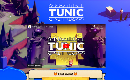
Captured from https://tunicgame.com/. Copyright 2022, ISOMETRICORP Games Ltd
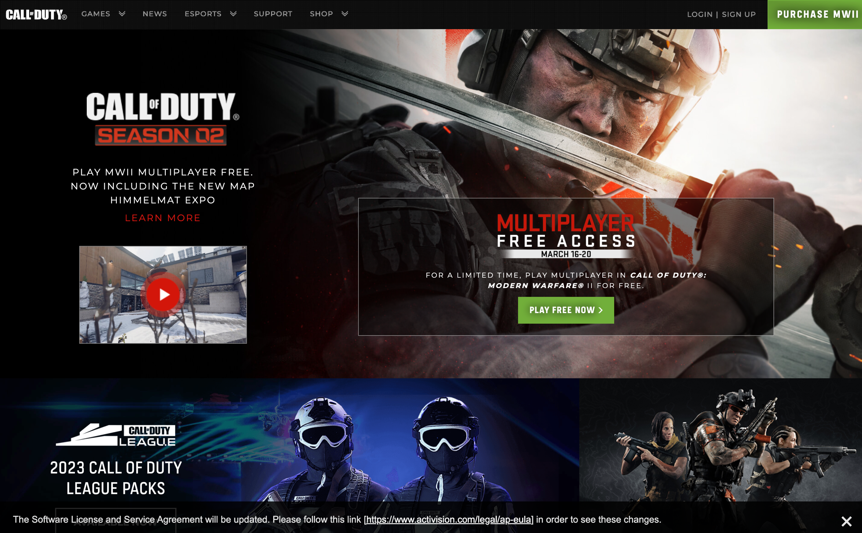
Captured from https://www.callofduty.com/uk/en/. Copyright 2023, Activision Publishing, Inc
This is how the web works. Whatever area your website is in, informs the conventions you follow, the design your audience is accustomed to and best practices you follow. The web is unique because it can sit within other platforms and break the conventions of the platform it sits within.
Wrapping it all up
Designing and developing digital experiences isn’t easy, but when you embrace the platform you’re building for and cater to the differences, opportunities, and conventions users are accustomed to, the experience feels better. It feels cohesive and natural. This takes effort, there’s no silver bullet regardless of marketing about multi-platform solutions — you still have to learn the platform you’re building for and cater to people’s expectations. The web is an exception in that it is more ubiquitous than other platforms, but when you take a closer look, patterns begin to emerge. It’s important to weave your experience into existing contexts, so they can coexist.

Currently a Senior Product Engineer at zeroheight. Actively designing and building the agentic systems that respond to tools like Figma to update your design system documentation automatically as well as a flexible platform to manage agents.