Automatic Dark Mode for your website
How to detect the user’s theme in MacOS Mojave and use it to change the look of your website
2 minute read
( )
This post is also available in different formats so you can read on the go or share it around!
Since this article was written, browser support has increased for prefers-color-scheme and Dark Mode UIs have become even more popular. You can now follow along and create more dynamic UIs that take advantage of this feature on all modern browsers.
There's also a new section with a link to how you might go about designing a dark mode for your own websites.
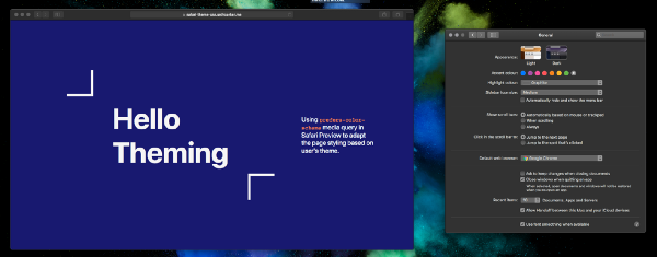
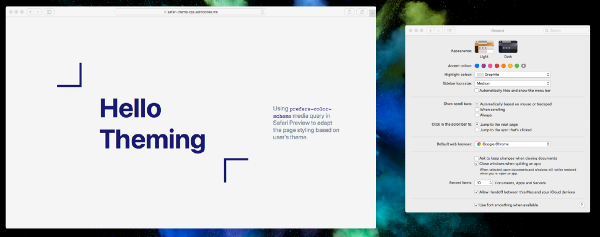
Switching between light mode and dark mode with our test web page
Dark mode is in right now. It’s easier on your eyes in low light environments and it’s a refreshing change from the light metallic greys we’ve seen over the years. A distinguishing visual feature of MacOS Mojave is Dark Mode and app developers can take some steps to update their apps to take full advantage of this new feature, but what can we do as web developers to tap into this?
Some new media queries have the answer, you can check out the spec for prefers-color-scheme. The spec defines light, dark and* no-preference* options. The Safari team is on the case, so let’s test it out.
What can we create?
I put together a quick demo of what we can achieve with some basic styling rules and prefers-color-scheme.


How do I get started?
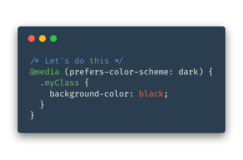
So how can we achieve this effect? Getting started is as easy as adding a media query to your CSS like so.

You can target dark mode with:
@media (prefers-color-scheme: dark) { ... }
or target light mode with
@media (prefers-color-scheme: light) { ... }
In my example, we do a simple inversion of the colour pallet with something like:
body {
  background-color: whitesmoke;
}

.title {
  color: midnightblue;
}

@media (prefers-color-scheme: dark) {
  body {
    background-color: midnightblue;
  }

  .title {
    color: whitesmoke;
  }
}
Awesome let’s start using it!
Slow down there, as with most new and exciting CSS, not all browser vendors have implemented prefers-color-scheme yet, and it’s not even in Safari as of November but you can take a look using Safari Technology Preview.
Whether or not you’d like to use it, is up to you. I think it’s an interesting idea which could bring a dynamism to webpages without using JavaScript. It offers a chance to take into consideration the user’s preferences and use them to tailor your site without the user having to do anything. This makes for a consistent and delightful user experience.
Most modern browsers now support this feature so it's safe to use. We now have
The other part of the equation
Implementing different colour schemes for your website or web application is relatively simple but this is only part of the equation. There are a few questions you should ask yourself before you jump into making the change:
- Should you even create a dark theme?
- What colours will work well and be accessible?
- How do I make a UI that's delightful and not overbearing?
To help you on your journey, Miklos Philips has a great article on Toptal, "In the Spotlight: the Principles of Dark UI Design" which will help you make the right decision from a design perspective.
References
- Check out the full example source code on GitHub.
- Check out the website online (any modern browser should work).
Thanks for taking a look at something I think is pretty cool, please let me know if there is anything you’d like expanded upon or if you’d like to see more content of this nature. Happy coding!

A Fullstack Software Engineer working with React and Django. My main focus is JavaScript specialising in frontend UI with React. I like to explore different frameworks and technologies in my spare time. Learning languages (programming and real life) is a blast.